Overview
The Hebe Ceramics owner was looking to launch the brand officially and needed branding and an e-commerce site.
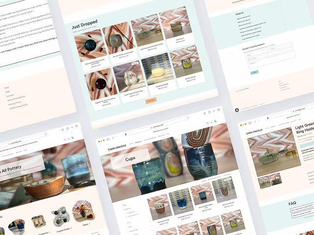
The result was a user-centric and responsive Shopify store where customers can buy products, sign-up for the newsletter, and find out about any upcoming events Hebe Ceramics was vending at.
Project Duration
Oct - Dec 2024
Tools Used
Figma, Figjam, Shopify,
Klaviyo, Google Forms
Problem Space
The Challenge
Sharing Hebe Ceramics with the World
The owner decided to start selling their work online and wanted something simple that met their basic needs: selling their work and sharing information about the company.
The problem I wanted to solve for was:
How might we design a frictionless buying and browsing experience for potential customers while also introducing people to the brand?
Discovery
Understanding the Challenge
Business Goals
Talking with the owner, I identified the needs and goals for the site:
- Since the company is new and building its social media presence, the site had to carry the majority of the weight of introducing the brand to people.
- Drive people to sign-up for the newsletter. The owner plans to offer email exclusive specials (birthday discounts, sales codes, etc.) and give insight into the creative process to connect with customers.
- Emphasis on a good mobile experience because the owner is expecting most of the traffic to the site will be through their social media account.
- Create a frictionless experience for purchasing and decision making to follow through with a purchase.
Considerations
Choosing an e-commerce website builder or building the site from scratch via Webflow.
Features

Newsletter Sign-Up

User Accounts

Event Calendar
Looking at the Competition
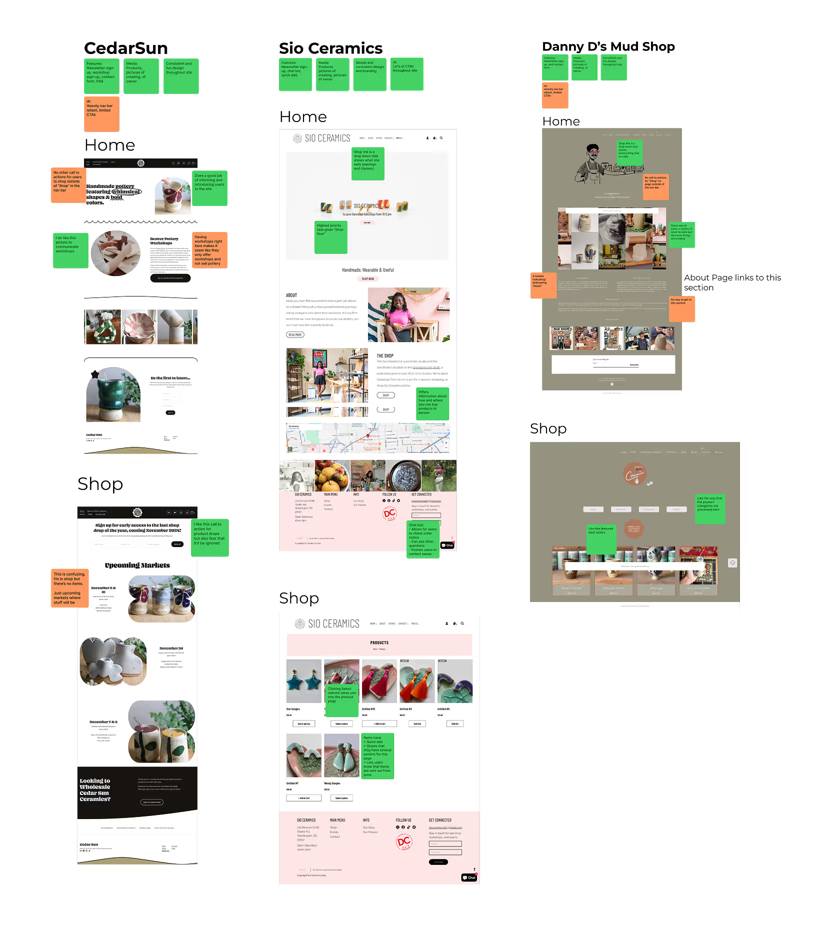
The owner shared sites they liked, sites they considered to be direct competition, and large companies in the ceramics industry.
I gained insight into how other ceramic businesses presented and talked about their products, the pages they had, and how they organized their information architecture.
Current Research
I used a combination of research from Nielsen Norman Group (NNG) and Baymard Institute to understand:
- Different types of e-commerce shoppers.
- What users expect of e-commerce sites
- Best e-commerce practices
Summarizing their research helped me to identify opportunities and ideas to explore as I moved.

The owner shared sites they liked, sites they considered to be direct competition, and large companies in the ceramics industry.
I gained insight into how other ceramic businesses presented and talked about their products, the pages they had, and how they organized their information architecture.

Current Research
I used a combination of research from Nielsen Norman Group (NNG) and Baymard Institute to understand:
- Different types of e-commerce shoppers.
- What users expect of e-commerce sites
- Best e-commerce practices
Summarizing their research helped me to identify opportunities and ideas to explore as I moved.
Synthesizing
Define
Creating Structure
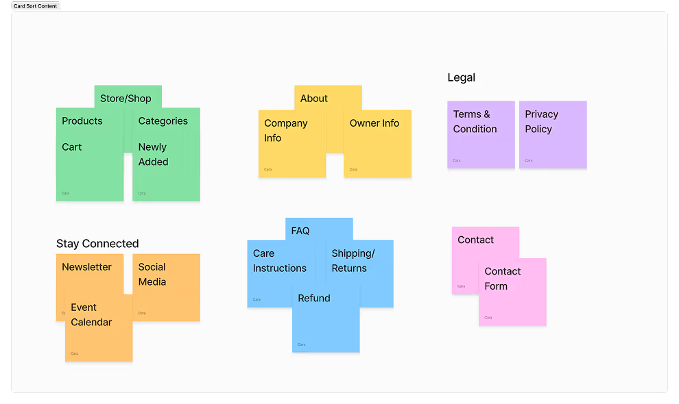
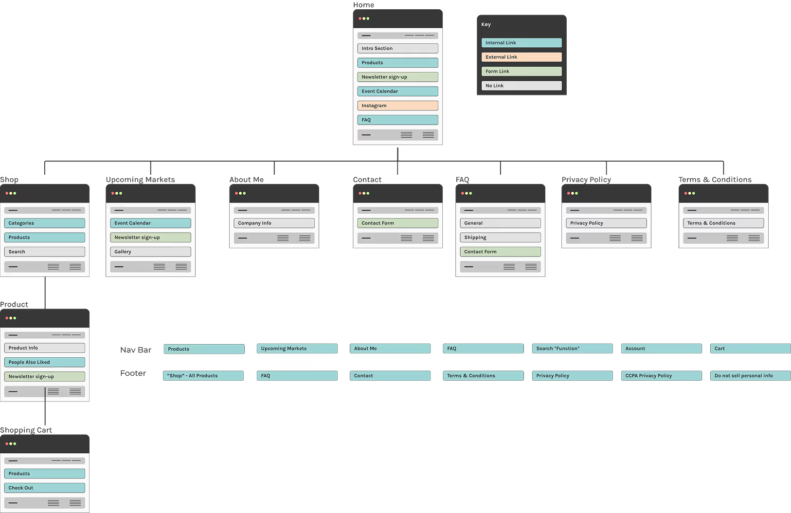
I set up a card-sorting exercise with the owner to organize their essential pages and content needed for the site.
From this exercise I was able to create both a site map and a site flow.


I set up a card-sorting exercise with the owner to organize their essential pages and content needed for the site.
From this exercise I was able to create both a site map and a site flow.
The site map allowed me to quickly see and identify page sections, links between pages, and any external links that would need to be made.

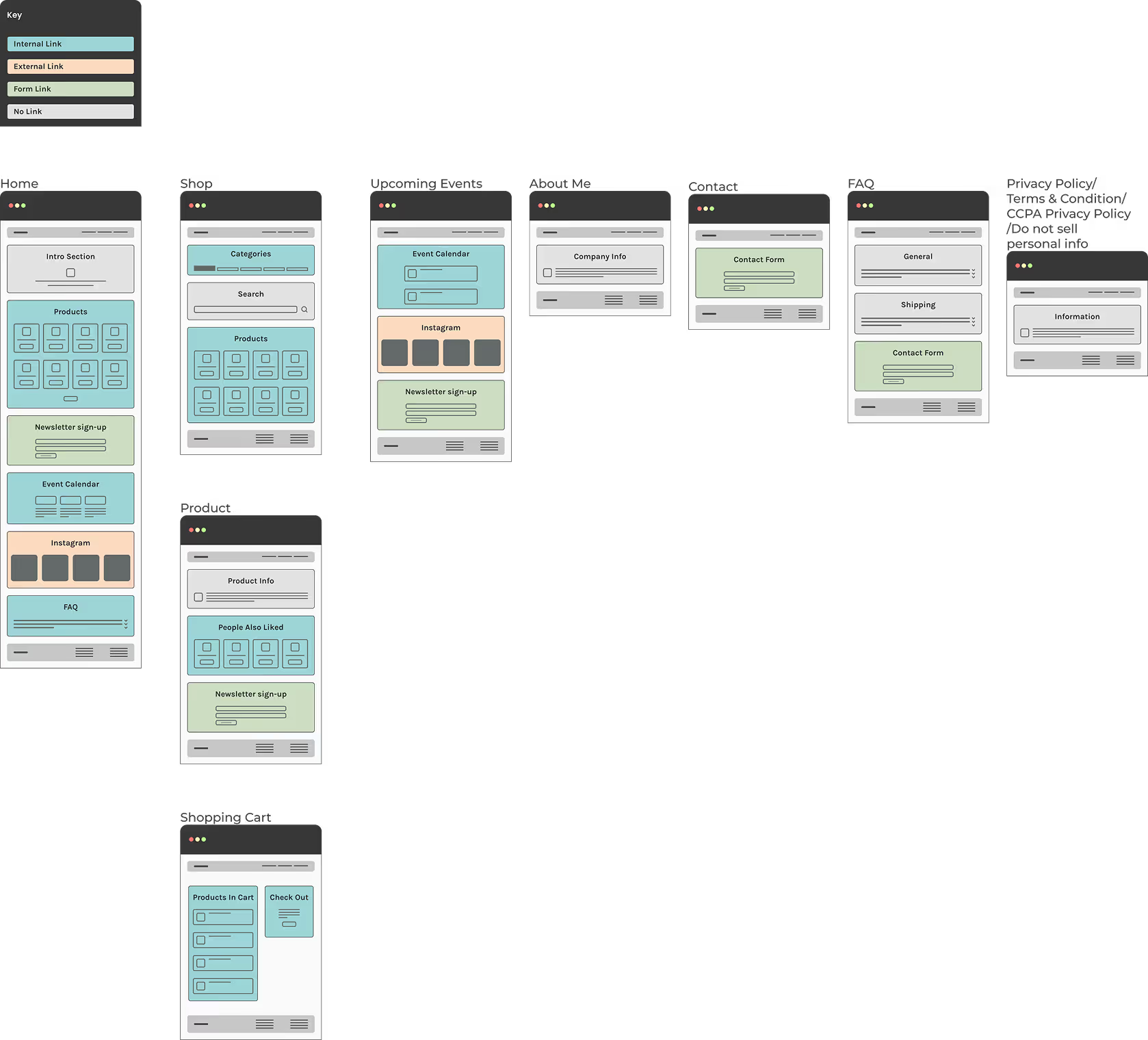
With the site map as reference, I expanded on the sections for a quick representation of the layout and the relationship between pages. This allowed me to see different user paths and work out any kinks that may occur, before jumping into wireframing.

Design
Design & Develop
Who to Use? Webflow vs. Shopify
After researching and looking at reviews of many e-commerce sites, I narrowed it down to Shopify and Webflow.
Webflow
- Most amount of flexibility and control of the design.
- Backend e-commerce isn't the strongest in comparison to Shopify.
Shopify
- Less flexibility and control of design, unless a Shopify developer is used for a custom template.
- Intuitive and easy to use back-end for e-commerce (inputting products, managing orders, sales, and shipping).
Because of the backend e-commerce features, Shopify was chosen to build the site. The owner wasn’t willing to spend money on a custom theme at this point, so it was decided to use a free template.
Wireframes and Page Design
Based on the site flow and my research, I sketched different layouts for the various pages that were needed.
Considerations
Since I was using Shopify templates, I had to figure out which of my sketches best matched what was available.
As I started working in their page builder and figuring out the capabilities of Shopify, I realized that some of the sections I designed wouldn’t be possible without paying for an app or subscription which were out of the budget for this project.
The Solution
The default layouts for the cart and payment pages had to be used but for some pages I was able to implement custom CSS fixes.
Web Copy
I focused on all of the copy to be clear, easy-to-understand, personable, friendly and fun.
Information Architecture
Navigation needed to be logically organized so people could find items and content they were expecting to find based on menu items and labels.

Based on the site flow and my research, I sketched different layouts for the various pages that were needed.

Considerations
Since I was using Shopify templates, I had to figure out which of my sketches best matched what was available.
As I started working in their page builder and figuring out the capabilities of Shopify, I realized that some of the sections I designed wouldn’t be possible without paying for an app or subscription which were out of the budget for this project.

The Solution
The default layouts for the cart and payment pages had to be used but for some pages I was able to implement custom CSS fixes.
Web Copy
I focused on all of the copy to be clear, easy-to-understand, personable, friendly and fun.
Information Architecture
Navigation needed to be logically organized so people could find items and content they were expecting to find based on menu items and labels.
Color & Media
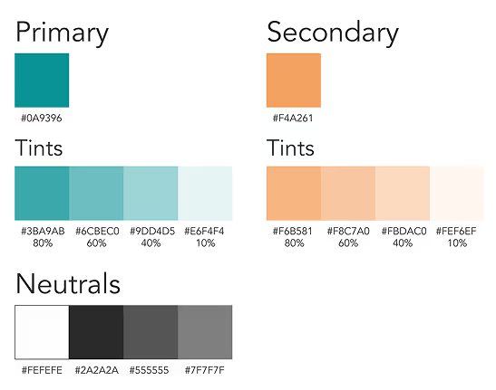
Since Hebe Ceramics is personal to the owner, they wanted to incorporate their favorite color teal into the branding. Orange was chosen as the secondary color because it is complementary and the owner wanted something that was associated with positive energy.
Outside of the home page, the branding colors were to be used as accents throughout the site.
The product photography is the priority and needed to be heavily featured.

Typography
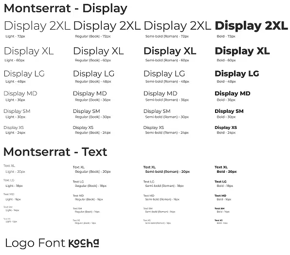
The owner was looking for branding that was associated with fun, I chose fonts that had a bit of playfulness to it but keeping in mind legibility.
Two types of fonts were chosen:
Kocha for the logo and headings.
Monsteratt for all other text because of the moderninty and legibility.
Constraint: Due to the Shopify theme limitations, I wasn’t able to implement Kocha for headings at this time.

Logo
Hebe Ceramics is named after the Greek Goddess Hebe, she represents youth or prime of life and functioned as a cupbearer to the gods and goddesses of Mount Olympus. With that in mind, I incorporated a chalice in the logo to represent Hebe and her position as a cupbearer.

User Testing
User Testing & Feedback
Testing Goals
My focus for testing was to gain insight on the content of the product and FAQ pages, the information architecture, and the search and filter features. The two user groups I identified that I wanted to test with were people who have bought ceramics before (whether in person or online) and those who were interested in buying from small creators.
Testing the Content
- Were questions answered that both seasoned and newer pottery buyers might have?
- Gain insight into what other questions both groups would have.
- Any other improvements that could be made to make buyers feel confident in following through with a purchase.
Information Architecture and Search & Filter
- Did the site meet people's expecations for searching and navigating it?
Overall, I received positive feedback on all areas with some minor design and content fixes.
Product Category Pages
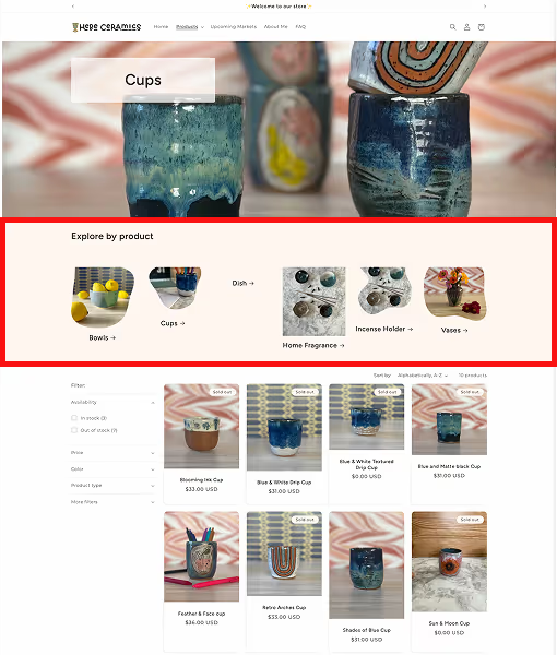
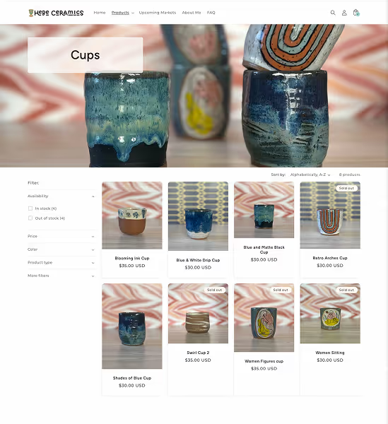
Multiple testers noted that after clicking on a product category, they expected to see related products and not the “Explore by Product” banner again for that page.
To align with expectations, I removed the banner from all product category pages.
Before

After

FAQ Page
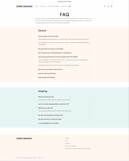
During testing, I was able to pinpoint other questions that people had that could be added to the FAQ's.
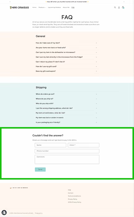
I also noted some testers went looking for a form or mentioned that they would reach out to ask a question if their questions weren't answered in the FAQ’s.
To cut out customers navigating elsewhere to figure out how to contact the owner, I added a contact form at the bottom of the page.
Before

After

Final Design
Meeting Design Goals
With the final design I wanted to prioritize:
- Funneling people to sign-up for the newsletter through CTA’s placed in areas and pages that made sense.
- Use CTA’s to move people quickly to items.
- Convey the Hebe Ceramics brand via fun but subtle design.
- Body copy that accurately describes and conveys information needed for customers to make an informed decision and complete a purchase.
- Implement an event calendar, newsletter sign up , and social media integrations.
The final result is a responsive and user ready Shopify store that increased brand knowledge and allowed customers to make purchases.
Final Thoughts
Project Lookback
What I'd Do Differently
What I'd do differently
The project had a slightly tight timeline of 1.5 months and if given more time I would have:
- Researched more into the apps that allow for Figma or Webflow designs to be turned into custom Shopify themes.
- Another round of usability testing to further validate the design.
Future Plans
- Design a custom Shopify theme with a focus on accessibility as the free theme templates allow for limited customizations.
