Overview
G2Xchange (G2X) aims to change the perception of government contracting (GovCon) by making information easily accessible and helping companies make informed decisions.
My team was tasked with revamping and redesigning the G2X landing page so that potential new users could better understand the services and benefits of their products, easily find information, and sign- up for a new account effortlessly.
Team
Product Manager
3 UX Designers
UX Researcher
Project Duration
Dec 2021 - Mar 2022
Tools Used
Figma, Figjam,
Miro, Dovetail
Problem Space
The Challenge
New Ownership, New Goals
The world of GovCon has been known to be inaccessible and complicated for small businesses and newcomers. G2X aims to change that by making information easy to find.
G2X in the past has relied on word-of-mouth marketing to attract new customers to the site. The initial design assumed that visitors already knew what G2X offered and why they were better than its competitors.
With new ownership, they wanted to increase the number of product users and make G2X a name that everyone in the GovCon space knew about.
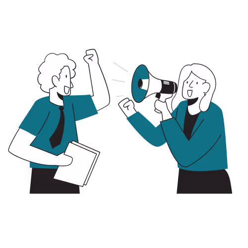
Potential Customers Don’t Know What They are Getting
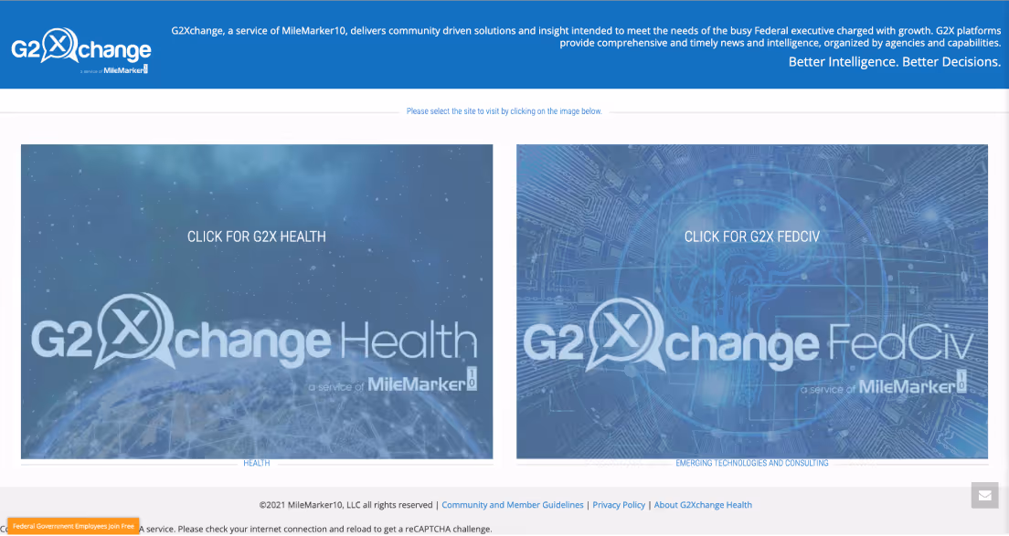
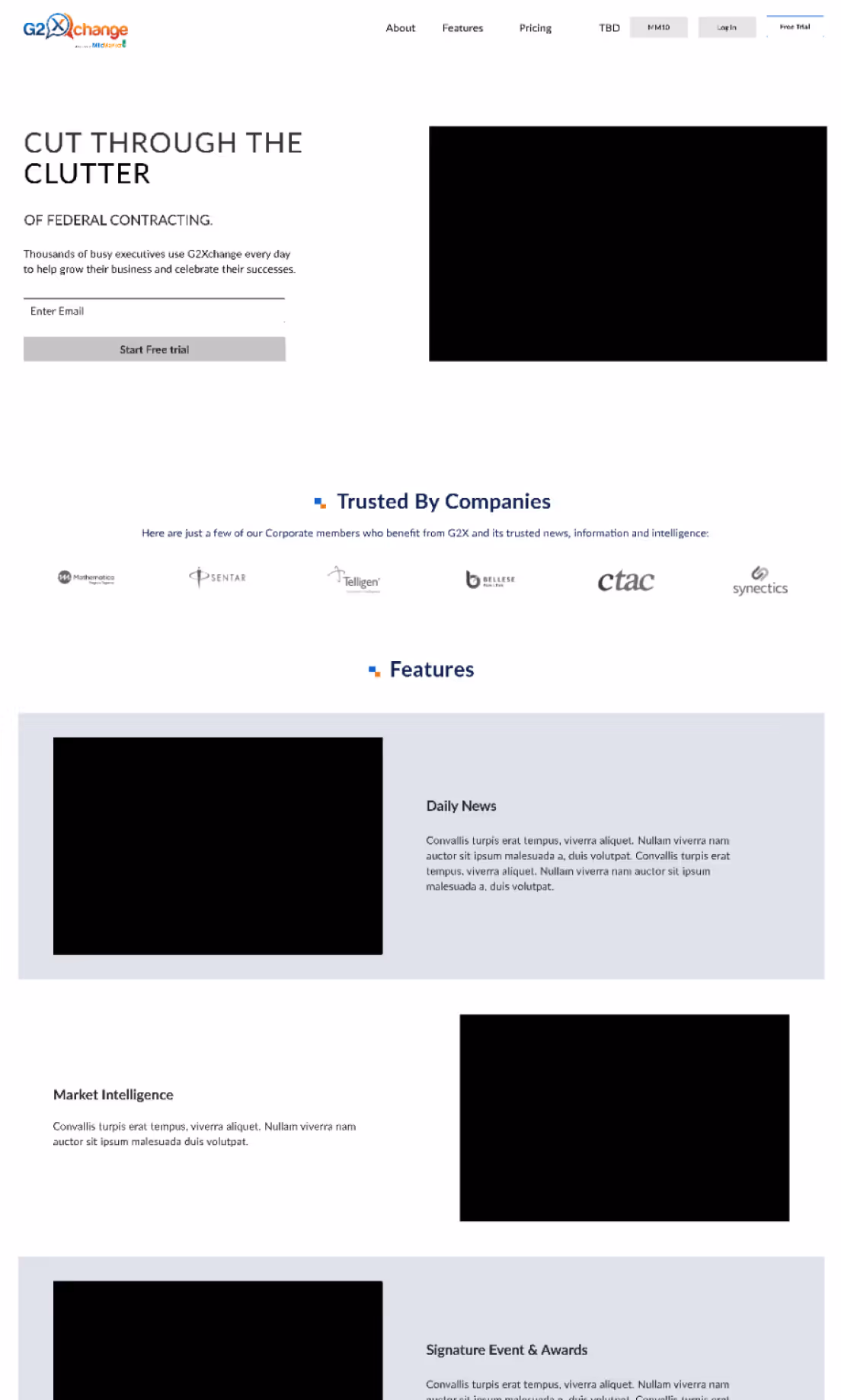
Old G2Xchange homepage
The landing page and subsequent pages failed to inform people what services G2X provides and how it is a benefit to them. The lack of information has turned away potential customers from signing up.
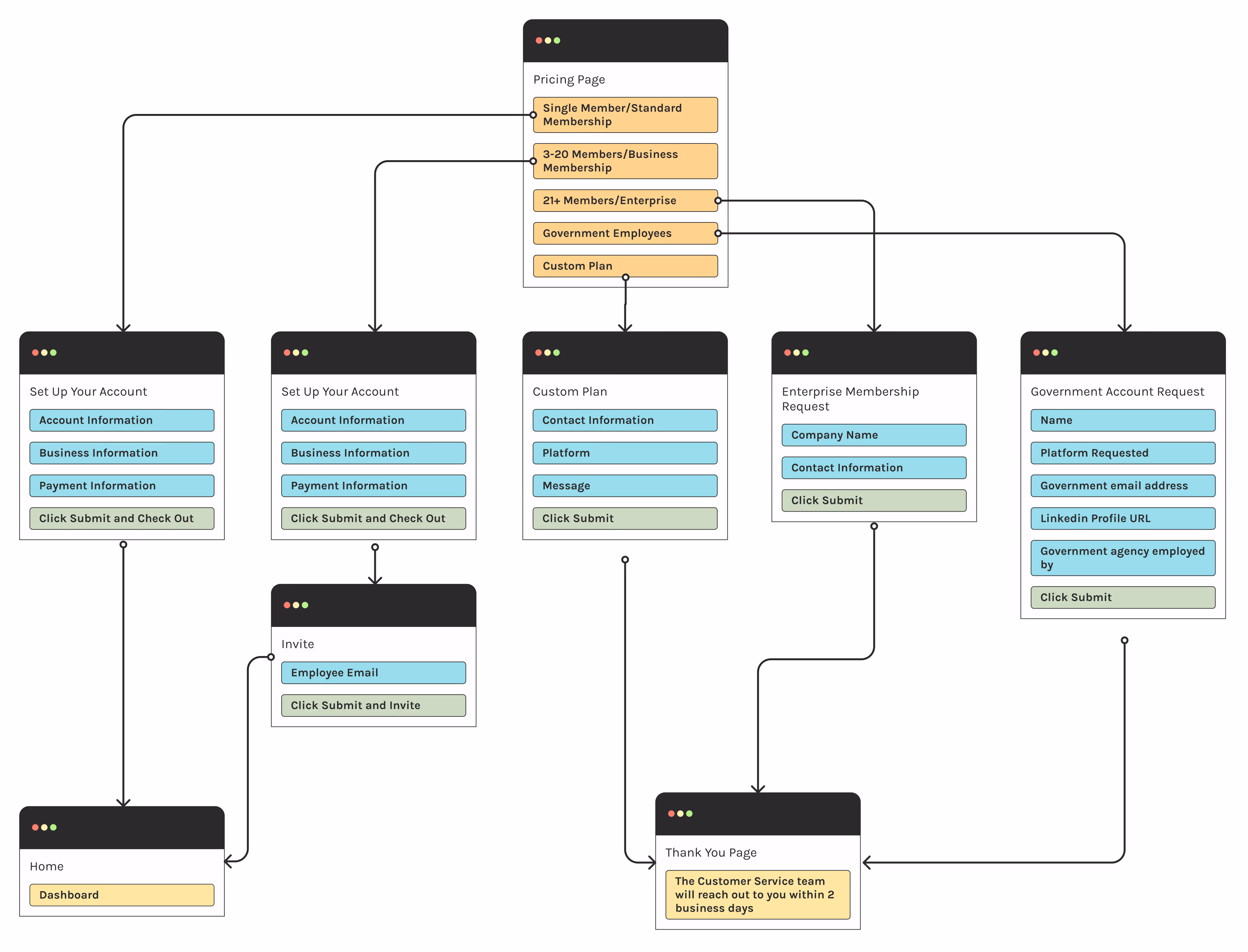
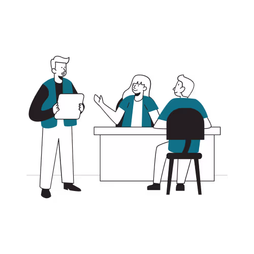
Sign-Up Flow Delays Access and Relies Heavily on the Customer Success Team
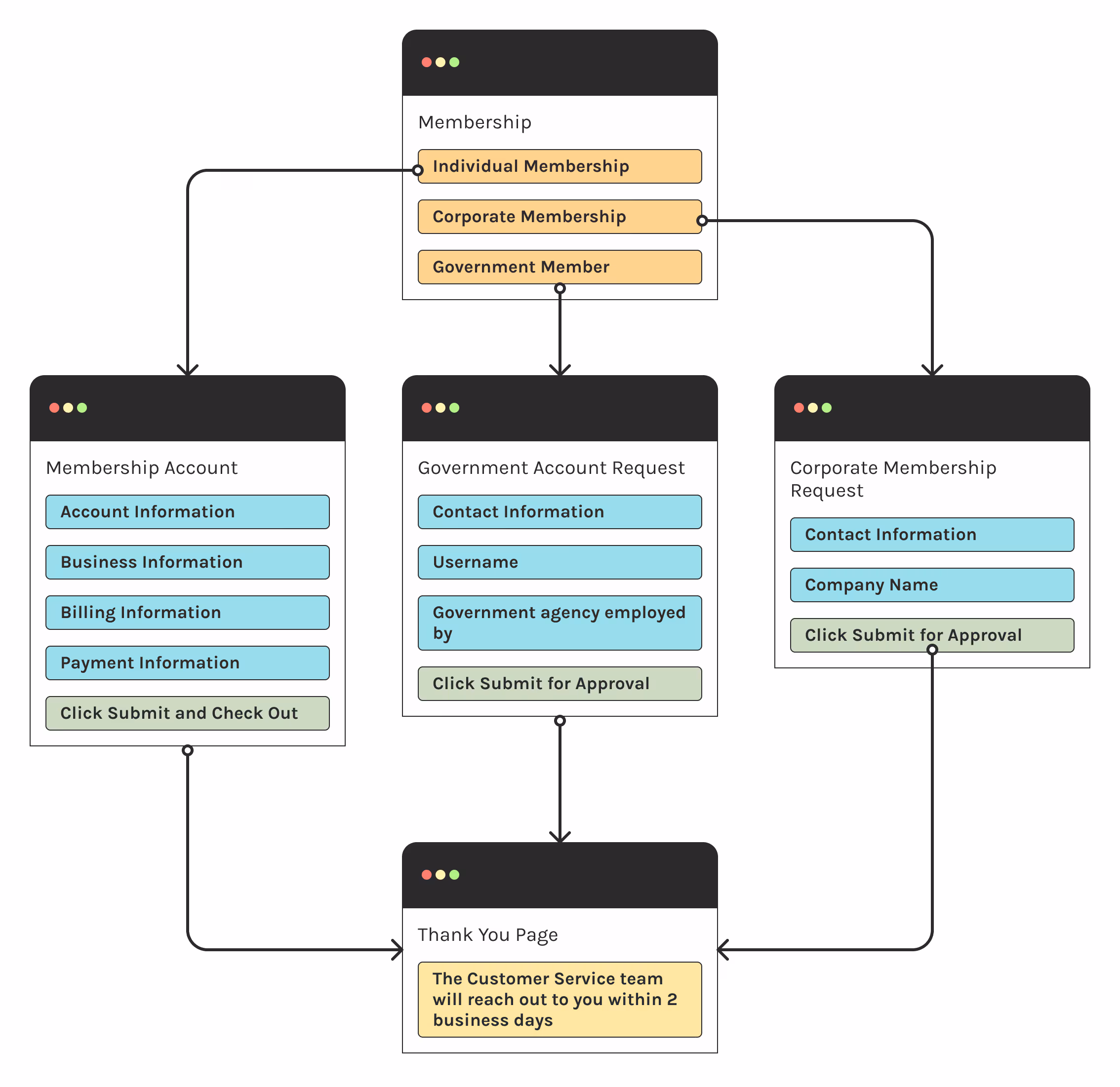
Old Sign-Up Flow
The original sign-up process relied heavily on the customer success team and could keep users waiting up to two days to access their account.
Discovery
Understanding the Challenge
Talking to Stakeholders
We started our discovery phase by talking to stakeholders and understanding what was important for them to convey to new users, and also learn what they already knew about the current users.
Looking at the Competition
We looked at other popular GovCon sites that were similar to learn:
- How they spotlighted their features to users.
- What messaging they used.
Understanding Our Audience
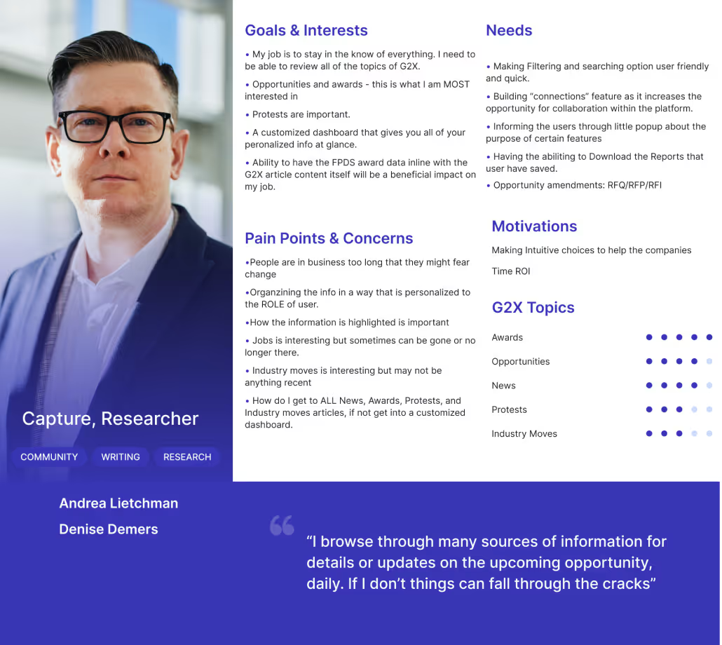
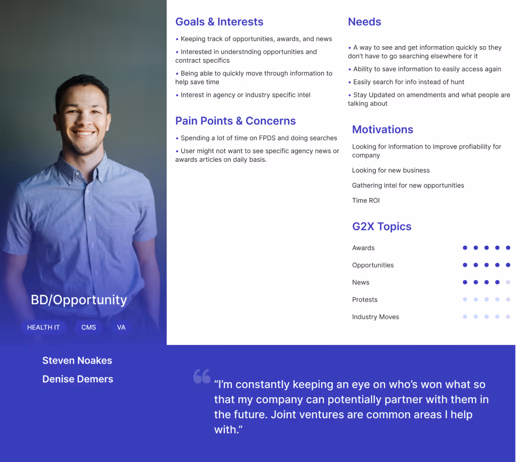
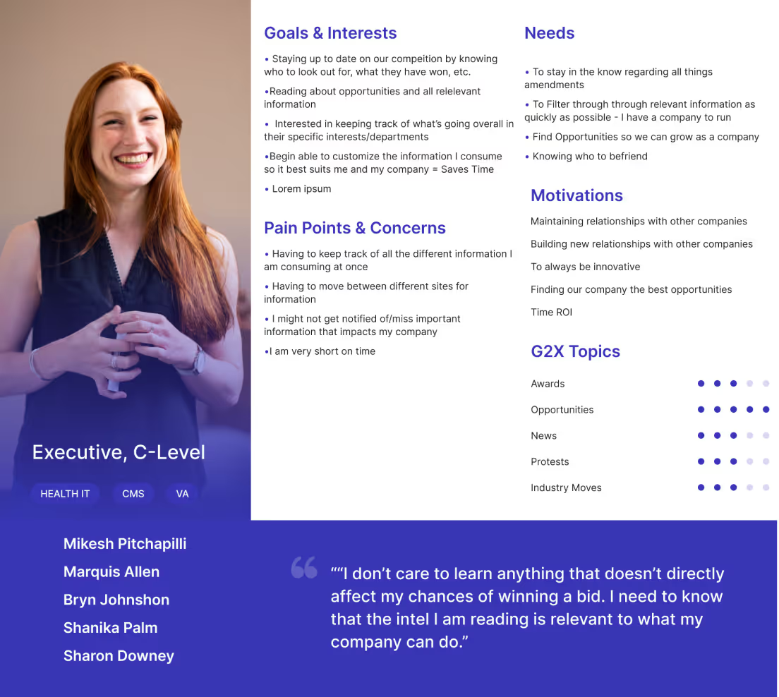
I looked to understand how our main user types:
- Used the site for their day-to-day tasks and understand the benefits to them.
- Assessed sites when looking for services related to their job and industry.
We created 3 fleshed-out personas based on the research.
Talking to the Customer Success Team
Sitting down with the customer success team, I learned that the majority of accounts created were for individual users or corporate accounts that were looking for 20 seats or less for only one product.
Team Alignment
With our findings from our user research and stakeholder conversations, the design team aligned on solving:
How might we make it easier for new users to understand what G2Xchange does, how it can benefit their business, and how they can get into the site quicker.
Synthesizing
Define
What We Learned
Need Information Quickly
- Time is an important factor for all three personas.
- They want to quickly and clearly understand the value they are getting without sifting through a bunch of information.
What Interests Them
- Each persona uses the site differently and is looking for different things.
- We learned their interests and how to talk about it in a way that is relevant to their duities.
Updated Site Flow and Sign-Up Flow
We re-designed the site flow to better align with the new needs of the site, as well as an update to the sign-up flow to get users into the site sooner.
Sign-Up Flow
A new sign-up flow and pricing structure were developed to allow the most common membership types into the site sooner and take some work off the customer success team.
Site Flow
A new site flow was created for less confusion about the products and services that G2X offers.
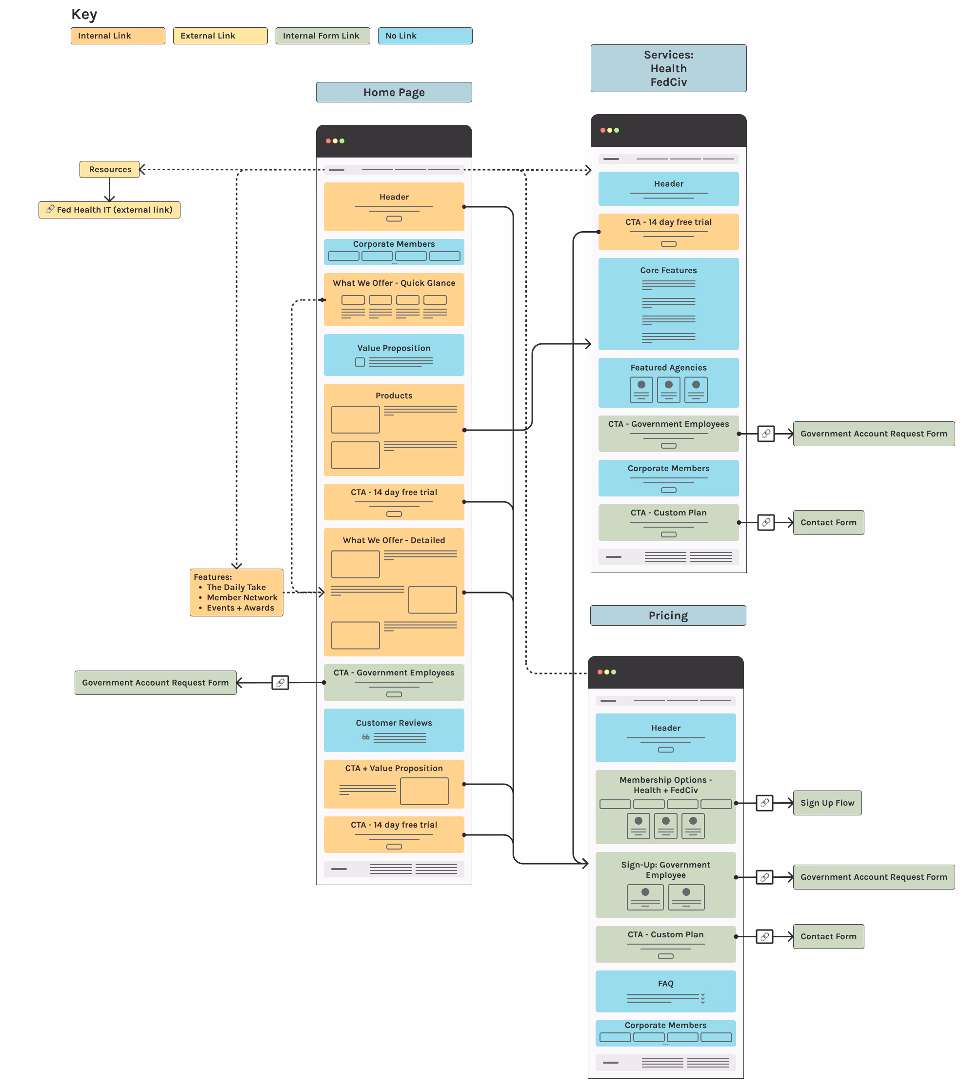
A new site flow was created for less confusion about the products and services that G2X offers.
A new sign-up flow and pricing structure were developed to allow the most common membership types into the site sooner and take some work off the customer success team.
Project Scope Update
As we wrapped up our research, stakeholders decided they also wanted to introduce free trials, since the new design doesn’t allow users to see the site’s content.
Design
Design & Develop
Wireframes, Mockups, and Iterations
Taking the information learned from our research phase, I applied the findings to my sketches and wireframes. As a team, we reviewed and combined ideas best aligned with the research.
We moved through various iterations before landing on two different versions.
Constraints
While a rebrand was in the works, we were limited to using the current branding provided by the marketing team.
We also kept the current users in mind while choosing imagery and UI choices, we wanted to avoid deterring them with a drastically different look and feel at this moment in time.
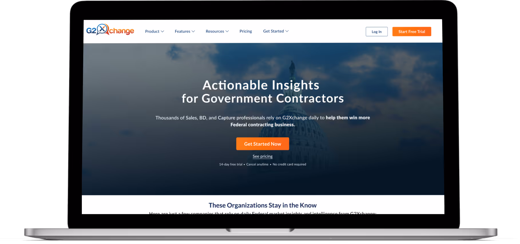
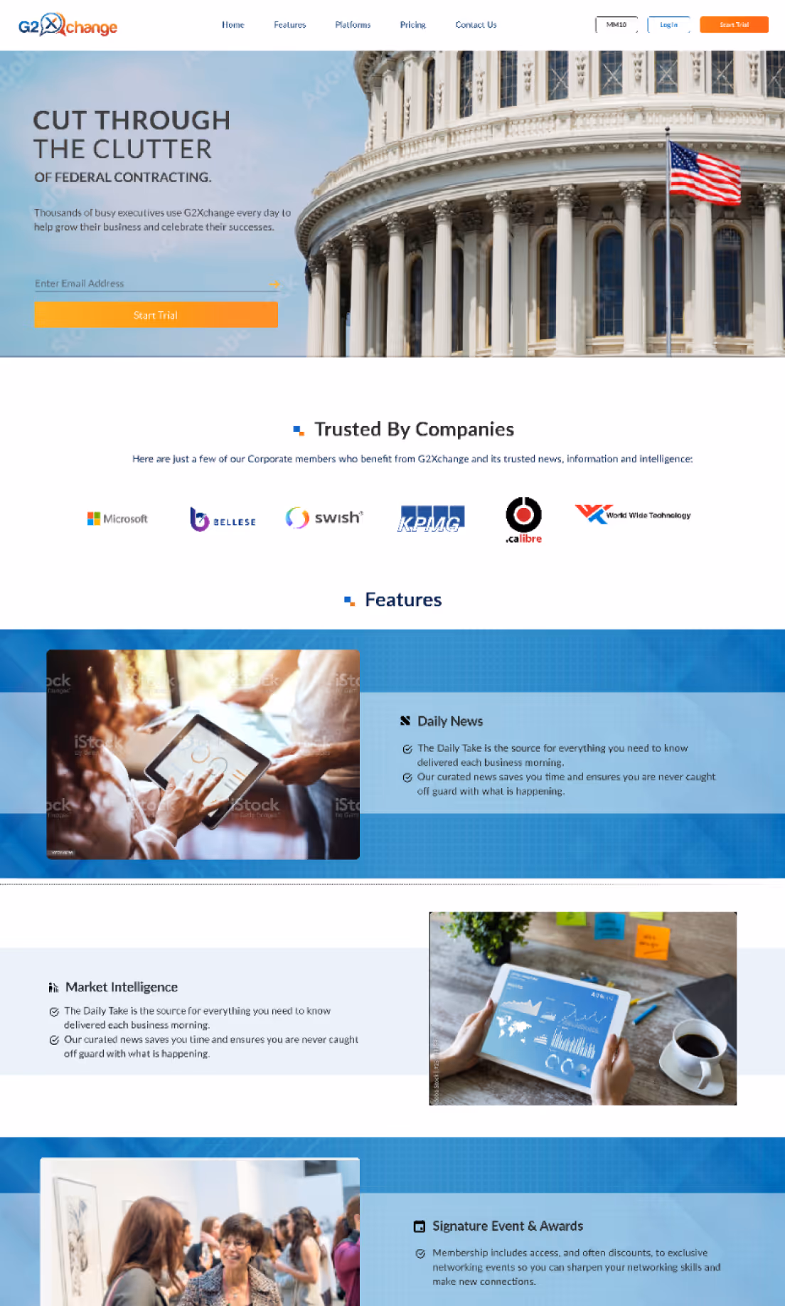
Hi-Fi Wireframe
Hi-Fi Mockup
User Testing
User Testing & Feedback
Testing Goals
Before we dove into user testing, we shared designs and design decisions with our stakeholders to solicit feedback. We made minor content changes based on their feedback, but held off on bigger changes to see if user testing revealed the same issues.
I wanted the user testing to validate if:
- The value of G2X was conveyed.
- The sign-up flow was easy to go through.
What We Learned
Condense "Features" Section

Users would prefer a condensed "Features" section so they can quickly skim through it.
Catching Users Attention

Users felt like they needed more emphasis on why they should choose G2X. Which was in line with feedback we received from stakeholders.
Final Design
Meeting Design Goals
With the final design I wanted to prioritize:
- Potential users could easily understand what G2X does and the benefits to a user's business.
- Easier navigation through site.
- New users to have immediate access to the product.
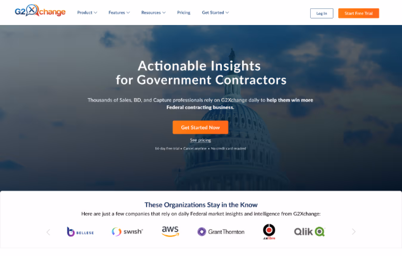
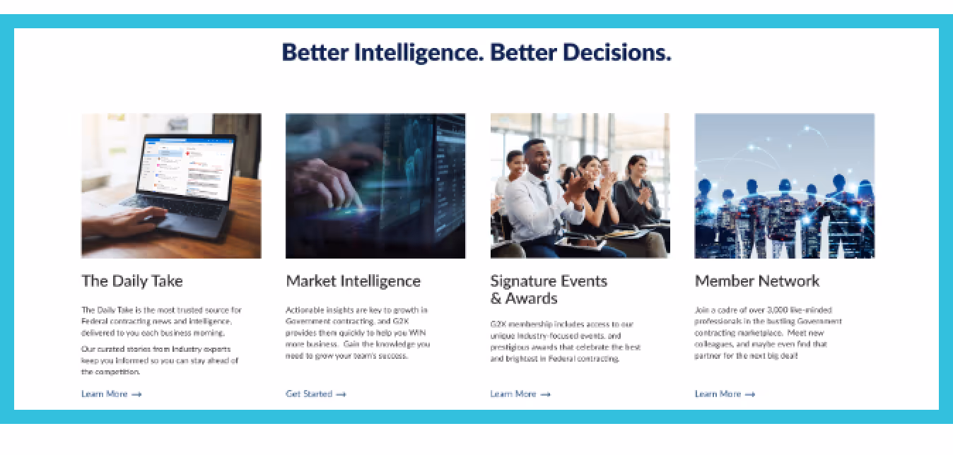
Condensed Features Section
Based off of user testing, we added a new section that succinctly states what we offer and the benefits.
This was our biggest goal with the redesign.
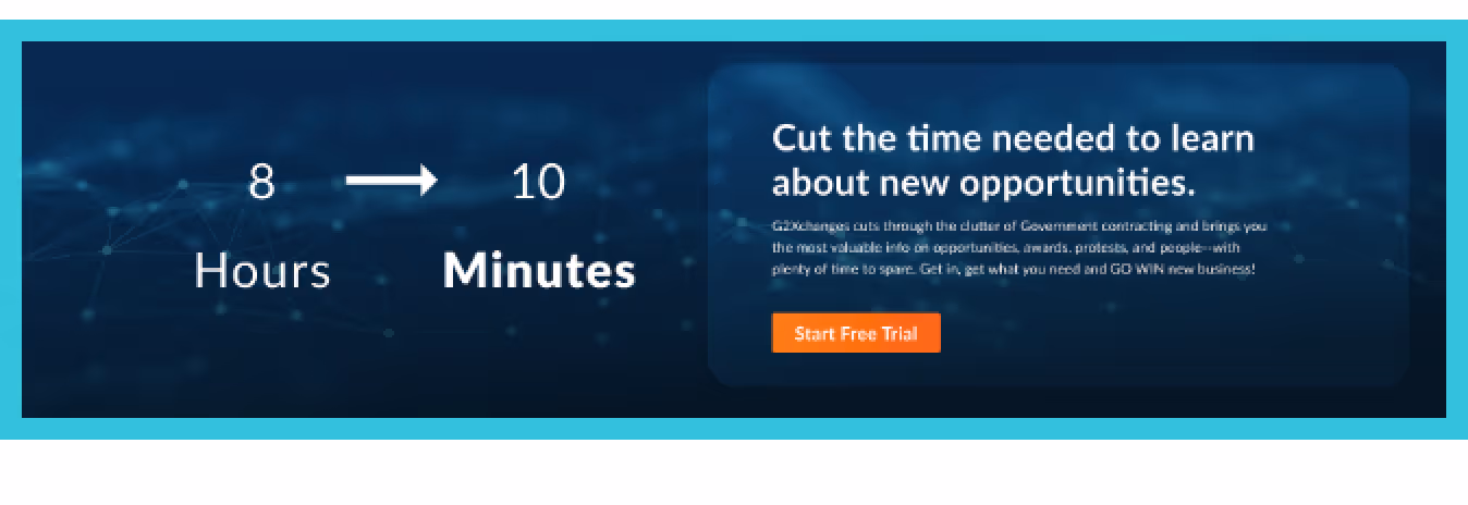
Catch Users Attention
Taking the feedback from our stakeholders and user testing, this section was used to define our value proposition.
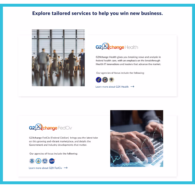
Information About Products
On the previous site, users had to click into each page to find out what Health or FedCiv focuses on.
With the new designs, we removed the unnecessary click and shared the information upfront.
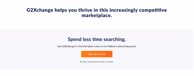
Features in More Detail
A more detailed look into the features that are offered and how they can benefit users to achieve their goals.

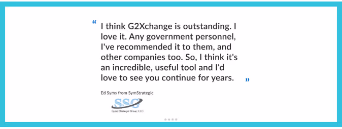
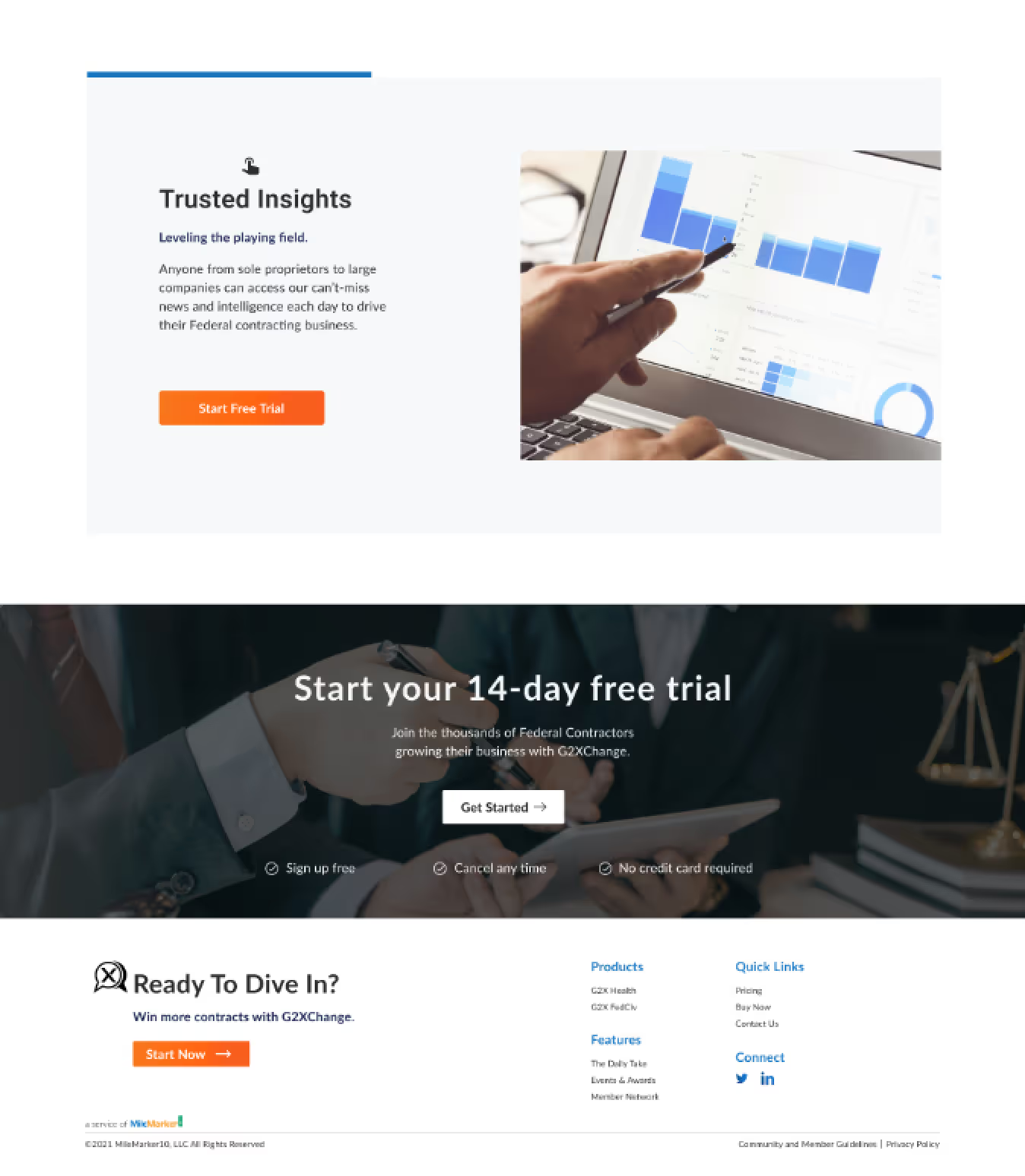
Reviews
Trusted sources that evangelize the product. This area shares real users experience with the product, how they use it, and how it's benefited them.
Condensed Features Section
Based off of user testing, we added a new section that succinctly states what we offer and the benefits.
This was our biggest goal with the redesign.
Catch Users Attention
Taking the feedback from our stakeholders and user testing, this section was used to define our value proposition.
Information About Products
On the previous site, users had to click into each page to find out what Health or FedCiv focuses on.
With the new designs, we removed the unnecessary click and shared the information upfront.
Features in More Detail
A more detailed look into the features that are offered and how they can benefit users to achieve their goals.
Reviews
Trusted sources that evangelize the product. This area shares real users experience with the product, how they use it, and how it's benefited them.
Impact
With the updates to the landing page we:
Increased Visits and Time on Site
The updated site increased the amount of unique visitors as well as the length of time people stayed on the site.

Increased Sign-Ups
The updated landing page, the introduction of a 14-day trial, and an updated account sign-up flow led to an increase in customer sign-ups.

Final Thoughts
Project Lookback
Leading a Team
This was my first time leading and managing a team; it was a real step outside of my comfort zone.
As a leader, my goal for the team was to make sure everyone felt heard and comfortable sharing their thoughts. It was also important that we were all on the same page and meeting our sprint goals.
Collaborating with Developers Sooner
After we passed off the project, the developers were unable to fully ship our design due to the version of WordPress.
Bringing in the development team sooner when we were wireframing and thinking about interactions would have helped all of us understand our technical constraints.