My task for this challenge was to create a clock in and clock out flow that also took into account a state of my choosing laws regarding: shift length, number of required breaks and meals, and whether or not overtime is allowed.
I was given some constraints for this project and had to keep them in mind while designing:
Based on feedback of the app from healthcare providers, I was able to learn that they:
Healthcare providers had an issue clocking out.
“Sometimes I forget to clock out. I’ll open my app to clock in for my shift two days later and it’s still running.”
They forgot to take breaks due to their hectic days.
“It’s easy to get caught up in my work, and if I don’t take my break on time, I just don’t get one. I really need that time off my feet so I can get through the day.”

Sometimes their days blur together and they forget that they’re working a double and end up clocking out early.
“A lot of days blur together, and sometimes I’ll clock out and leave the building before I remember I’m working a double. It’s happened more than once, and now my coworkers make fun of me.”
I made some assumptions about the internal process of Clipboard Health as well features of the application:

If a provider forgets to clock in, customer service can make the change for them.

If a provider forgets to clock out, Clipboard Health goes by the time submitted for correct hours.
If a provider must clock out before their scheduled time, customer service can make changes in the back end.

The app automatically applies local laws based on location.
I researched Maryland laws regarding shift length, meal and rest breaks, and overtime and learned that:
an easy way to remember when to take their breaks, when to clock out, and when they’re booked for multiple shifts because they are often focused and busy with the work on hand and simply forget to complete these actions.
Thinking about what I had learned during discovery, I created a proto-persona based on the information that Clipboard Health had shared to help me better align and understand their users.
Primary Proto-Persona

Registered Nurse
33 years old
She sometimes forgets to clock out and submit her time sheet, which delays payment.
She Wants to be reminded to take her breaks.
She wants a reminder if she’s working multiple shifts so she doesn’t accidentally clock out.
Thinking about Harley and the issues she was having, I was able to identify some opportunities to intervene and create a task flow as well as sketching ideas for screens.
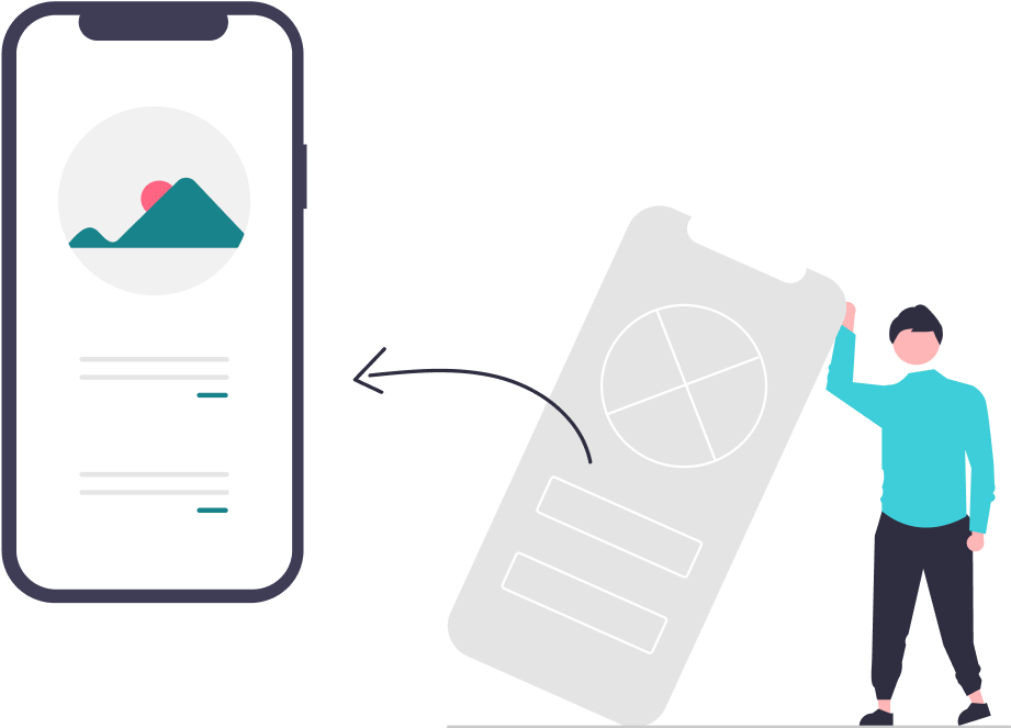

Taking different ideas from the sketches, I combined them into wireframes and tested with two different users.
Coming out of testing, I was given feedback that parts of my initial flow felt a little confusing and excessive for someone that might be in a rush.
I also got feedback on the layout for my “ongoing” screen that it felt like it lacked some information and that the icons felt very tight.
Users also wanted confirmation that their actions of clocking in and logging lunches were actually received by the app.
From the feedback I recieved I thought about important information that providers would want quick access to and made changes.
I also changed the layout of my icons and how they are shown to give more space between the icons and text.
Pop-ups were added to give users confirmation of clocking in and logging their lunch break.
I went back to the task flows I created and thought about how I could still have the same impact but in a simpler and more efficient way. I removed the extra steps and simplified the actions for users.
I was extremely proud with the work that I created and submitted in the timeframe that I had. Having to make a plan and work quickly helped me to get through this challenge, even if I had a bit of block the first 2 days. I was able to overcome it and move through the rest of the time with ease.
The Less Complicated the Better
In my initial user flow I was trying to do too much in order to protect the users in the event there were issues with their time or pay.
I didn't realize how excessive the flow became until I did some user testing and received feedback.
Sometimes simple is okay.